


Love Letters in Crayon: Cerulean
A common childhood gateway to lifelong æsthetic fixation.
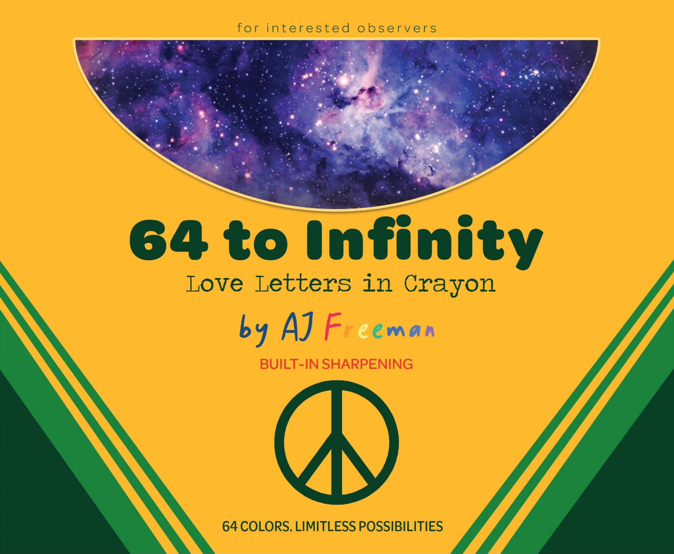
Every Friday afternoon, “64 to Infinity: Love Letters in Crayon” will illustrate the long, strange story of humankind in one of the 64 colors that make up this world-famous primary palette. Last Friday, we delved into the hidden significance of the seemingly innocuous Carnation Pink. In this week’s installment, we celebrate a truly spectacular shade that has launched many a lifelong love affair with color and form: Cerulean.
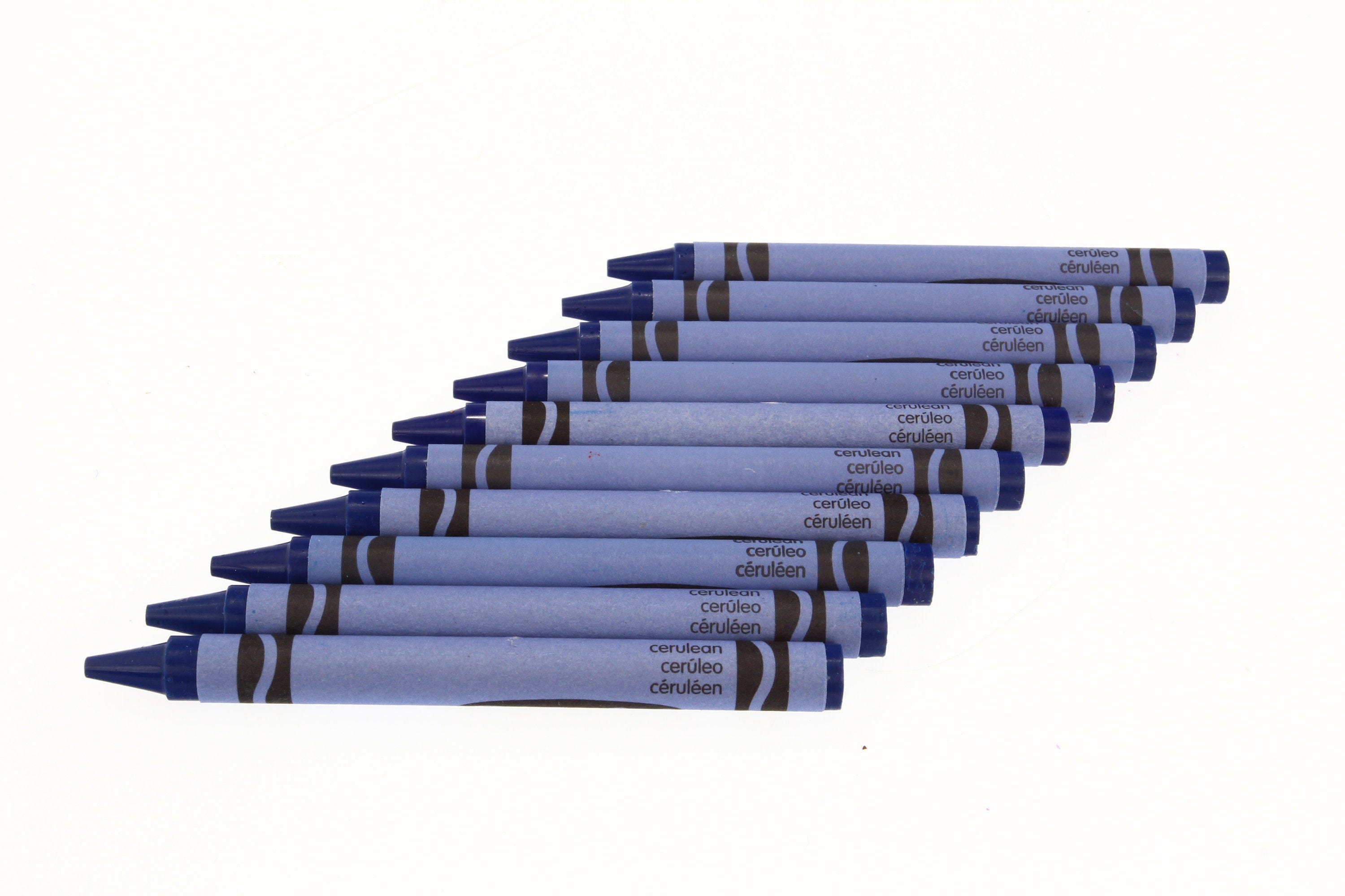
Blue may be the most common favorite color on The Planet, but for younglings who nourish their deep appreciation for æsthetics, the Cerulean crayon is a common gateway to lifelong fixation.
The name itself is awe-inspired, most likely derived from some skyward Roman eye’s attempt to worship and venerate the empyrean domain. “Caeruleus,” he may have managed to utter, a Latin word aimed at articulating the hue of heaven’s canopy falling from his lips into the dust as he sank to his knees in reverence. Here, a long-dead language endures in living color.
Soothing as misty seaside, sharp as the numberless teeth of an ice cave, Cerulean is regularly encountered in nature’s most memorable features. It invites descriptors such as “ethereal” and “papilionaceous” wherever it makes its fantastic appearance.
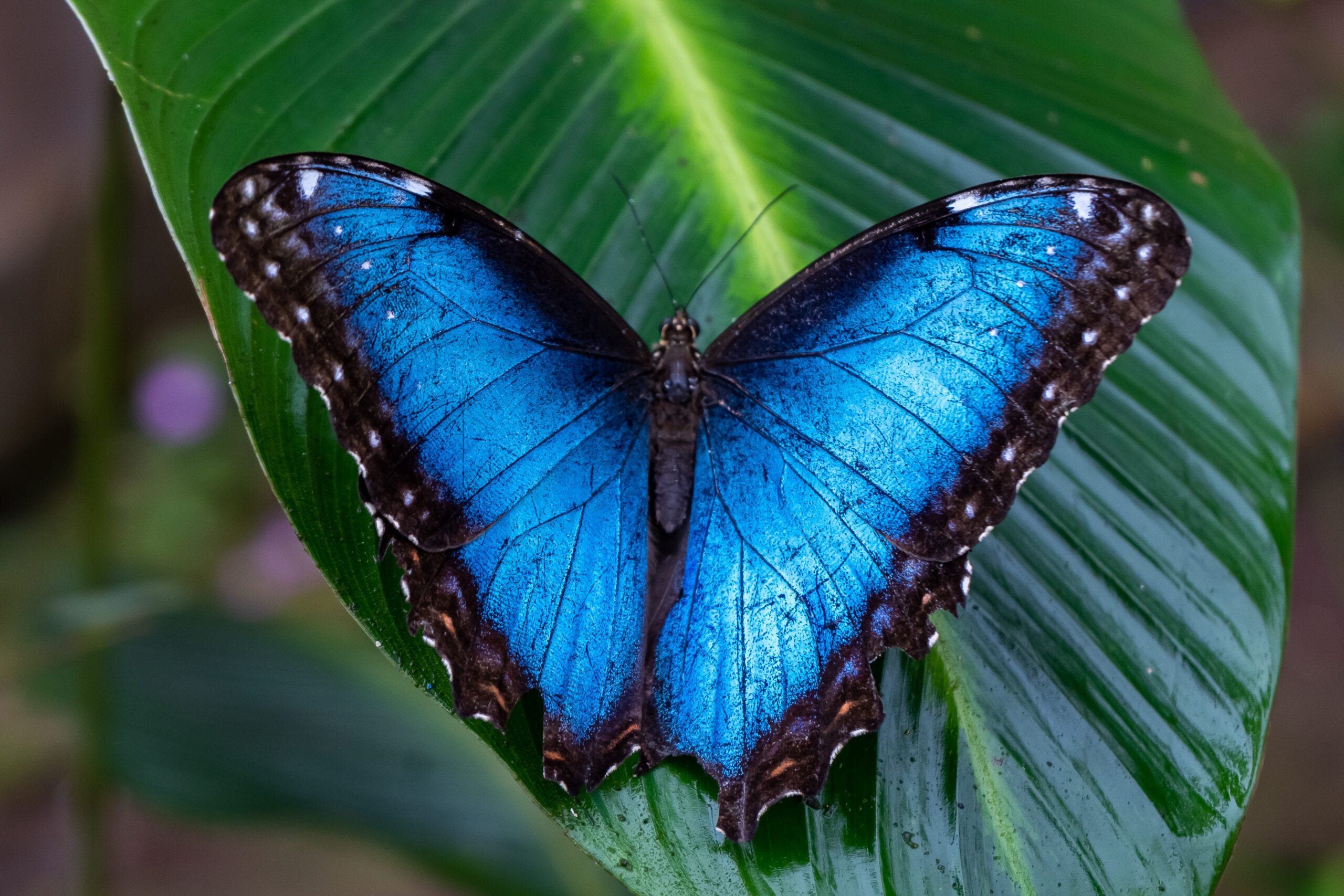
The vibrant coloring of a morpho butterfly’s wings offer a rare opportunity for both words to work in tandem, with their prismatic, pigment-free effect reflecting Cerulean to the eye and inspiring our pursuit of dye-free coloration.
Indeed, science has dragged Cerulean from an unobtainable palette before. For millennia only represented in human handcraft by pale imitations, history records that a viable pigment was only discovered in the late 18th century by Swiss chemist Albrecht Höpfner.
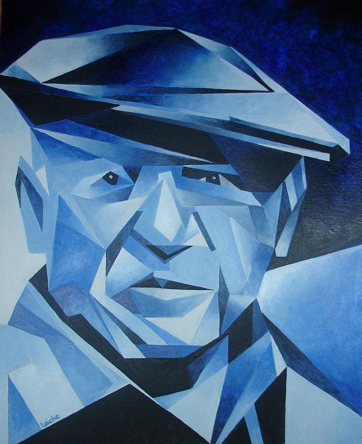
The immortal Vincent Van Gogh never benefited from its use in his numerous works featuring the sky, although last century’s Pablo Picasso partially avenged this loss to art during his Blue Period.
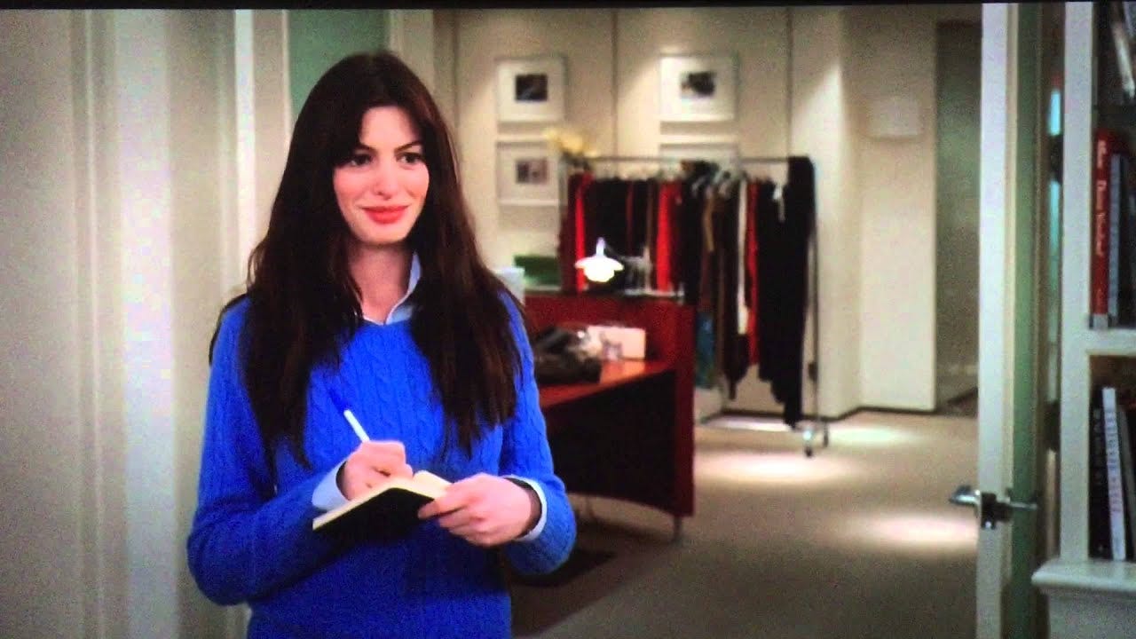
More than most, this shade showcases a particular attunement with the world of professional decoration. As the subject of a speech from a fashion-focused film featuring Anne Hathaway, a Cerulean sweater becomes a platform to consider the insuperable osmosis of cultural influence.
The actress herself is indeed the modern namesake of the Bard’s bride, weaving yet another layer of unexpected poetry into the genetic code of this color.
Cerulean, among plenty of contenders in The 64, may be the quintessence of interested observation.
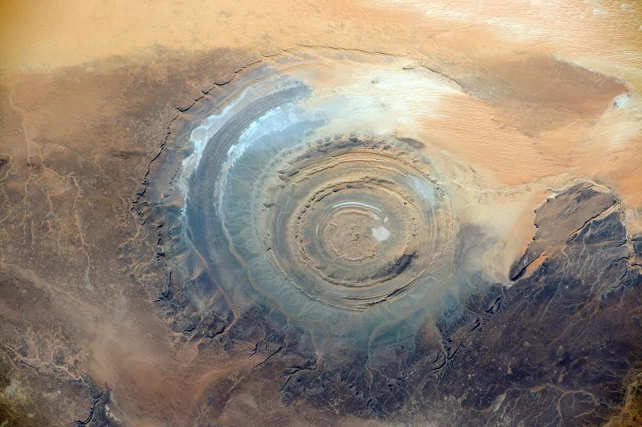
It converts witnesses at The Eye of Africa, a mystifying feature of the Sahara only appreciable from the privileged aerial views that countless ancestors sacrificed their lives to steal into the realm of possibility.
In this way the crayon can remind us that our richest rewards may still lie in an enlightened future, and now you see why I am obsessed with this color.
Cerulean has a well-earned share of passionate devotees among those in the know…with a color so easy to love, admiration comes naturally. Next week’s crayon may not be as instantly magical, but contains plenty of pragmatic perspective…join us next Friday afternoon as we pay tribute to that enduring shade of sustainable practicality: Chestnut!
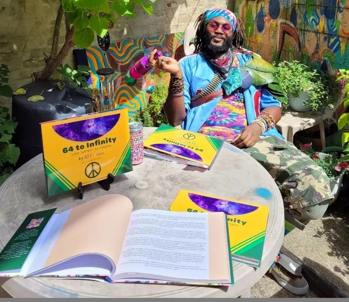
Hey, AJ here. You’ve already made my day by taking the time to check out this selection from my book, “64 to Infinity: Love Letters in Crayon!” Most writers live and die without ever being appreciated, and so every moment of your time is a personal gift to me.
My career as a writer is made possible almost entirely by readers like you. If you’d like to support human creativity directly, you can make a monthly contribution through Patreon.
….and if you’d like to see a second hardcover print run for “64 to Infinity: Love Letters in Crayon,” you can make a one-time donation to the “64 to Infinity” Print Run Fund.
Have you ever read the book Blue by Michel Pastoureau?
Honestly, the first thing that comes to my mind is Pokémon's Cerulean City.